|
 You can use any color in the kitchen. The main thing is that they should be well combined with each other and fit into the entire interior. How will lighting depend on the shade of the kitchen? First of all, the kitchen should have functional lighting. It is better to choose a bright white glow color, as it does not distort the color of the products. Place it so that there is no shadow from the cabinets on the work surface. Additional light can accentuate the kitchen model, its texture and color. You can use any color in the kitchen. The main thing is that they should be well combined with each other and fit into the entire interior. How will lighting depend on the shade of the kitchen? First of all, the kitchen should have functional lighting. It is better to choose a bright white glow color, as it does not distort the color of the products. Place it so that there is no shadow from the cabinets on the work surface. Additional light can accentuate the kitchen model, its texture and color.
White kitchen works best with colorful, bright lighting. If your headset is finished with gold, you should choose a lamp that gives off yellow light. This kind of lighting makes objects stand out and dilutes neutral tones. Cold lighting will require an interior with silver accessories.
There are no right colors. There are many prejudices about which colors should not or should be used in this room. But, of course, there cannot be a universal recipe. All shades can be appropriate in the kitchen. It is important to combine them correctly and take into account all the nuances. It is not the color that is important, but rather the effect that you want to get from it. Scientists have long proven that shades affect the human body. Some can suppress appetite, while others excite it. If the main color is not so favorite, look for shades. Any color has many cold and warm nuances.
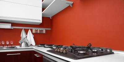
Red color. If you often go on diets, you are unlikely to be pleased with the scarlet headset. The red range perfectly stimulates appetite. Think of watermelons, raspberries, pomegranates, strawberries and other appetite boosters. You can use this color as accents. Pink, scarlet or burgundy are shades of red. Choose any.
Yellow. This color is often used as the main color in the kitchen. He is associated with butter, wildflowers and sunflower. This color is beneficial for improving digestion. The atmosphere of a sunny day is perfect for rooms where relatives and friends gather. Cool lemon and warm sandy colors will look different, although they belong to the same color scheme.
Green color. It has long been proven that food is best absorbed when surrounded by green. In addition, it lowers blood pressure and soothes an agitated mind. Buy a green kitchen or backsplash tile, or make your kitchen walls green.
Orange color. Shades of apricot and tangerine, papaya and brandy - all of them, no doubt, stimulate the appetite. But you should not get too carried away with too bright furniture and walls. For large surfaces, it is better to choose less intense shades. Cheer yourself up with juicy orange accents and accessories.
Blue colour. Everyone knows that blue suppresses appetite. But in reality, this is not entirely true, because otherwise people would not decorate dishes with cobalt patterns, create ceramics from Gzhel or blue porcelain. But this is one thing. But blue can distort the color of food. You are unlikely to like the blue lighting in the refrigerator. It's all about reflexes. But the blue color scheme is quite appropriate in the kitchen. Blue won't always be gloomy. Choose aqua or clear sky.
White color. This color is credited with having a positive effect on appetite. But dazzling white is tiring, and in our climate it can even look gray. It is for this reason that you should be careful with white. Prefer glossy cabinet fronts that can reflect other hues. In a well-lit space, white wins.
Black color. The general consensus is that black helps you concentrate on details when cooking. But it should be used in moderation, do not overdo it. But anthracite or charcoal furniture is best used in contrasting colors. It is advisable to choose light facades of household appliances and a white countertop.
Color matching in the kitchen
Is the color scheme in the kitchen always a combination of many shades? Kitchen set, textiles and walls. This is why you must first define the base tone and create a harmonious environment for it. Therefore, you should consider the compatibility of colors in your kitchen.
The contrast scheme assumes the use of opposite shades in the spectrum: one should dominate, and the second should enhance the effect. Depending on how intense the base color is, a calm or active combination is created. As a rule, contrasting combinations are used in modern kitchens.
The analogue scheme uses a combination of colors that are located side by side in the spectrum: green and yellow, blue and green.
If you are attracted to a monochrome scheme, use one base color of varying intensities. Choosing a similar scheme, you can't go wrong. The only thing to consider is that all shades should be either cold or warm.
If you have a small kitchen, don't use a contrasting scheme. After all, rich colors can make the kitchen even smaller.
Tatyana
|
")